Phlo Digital Pharmacy | July 2021
This project set out to improve the overall user experience for Phlo patients completing the onboarding process through our web app.
The UI of the existing solution was dated and had some major accessiblity issues, there was also little in the way of support for patients that experienced trouble as they made their way through the onboarding process.
We learned through user interviews prior to starting this project that users were getting confused by the nomination part of the sign up procedure. Also, by looking at the data we could see that users were dropping off at the GP selection stage, suggesting they were unaware that our services are only available in England, meaning their GP would be unavilable.
For many people their medicine can be a source of a lot of anxiety, usually ordering medication would mean you're unwell or treating a problem. If we could make the sign up and onboarding as easy as possible for users and improve how easily they can access medication we would have met our goals. Knowing these changes could make a real difference to people is what I enjoyed most about this project.
What could I do to help?
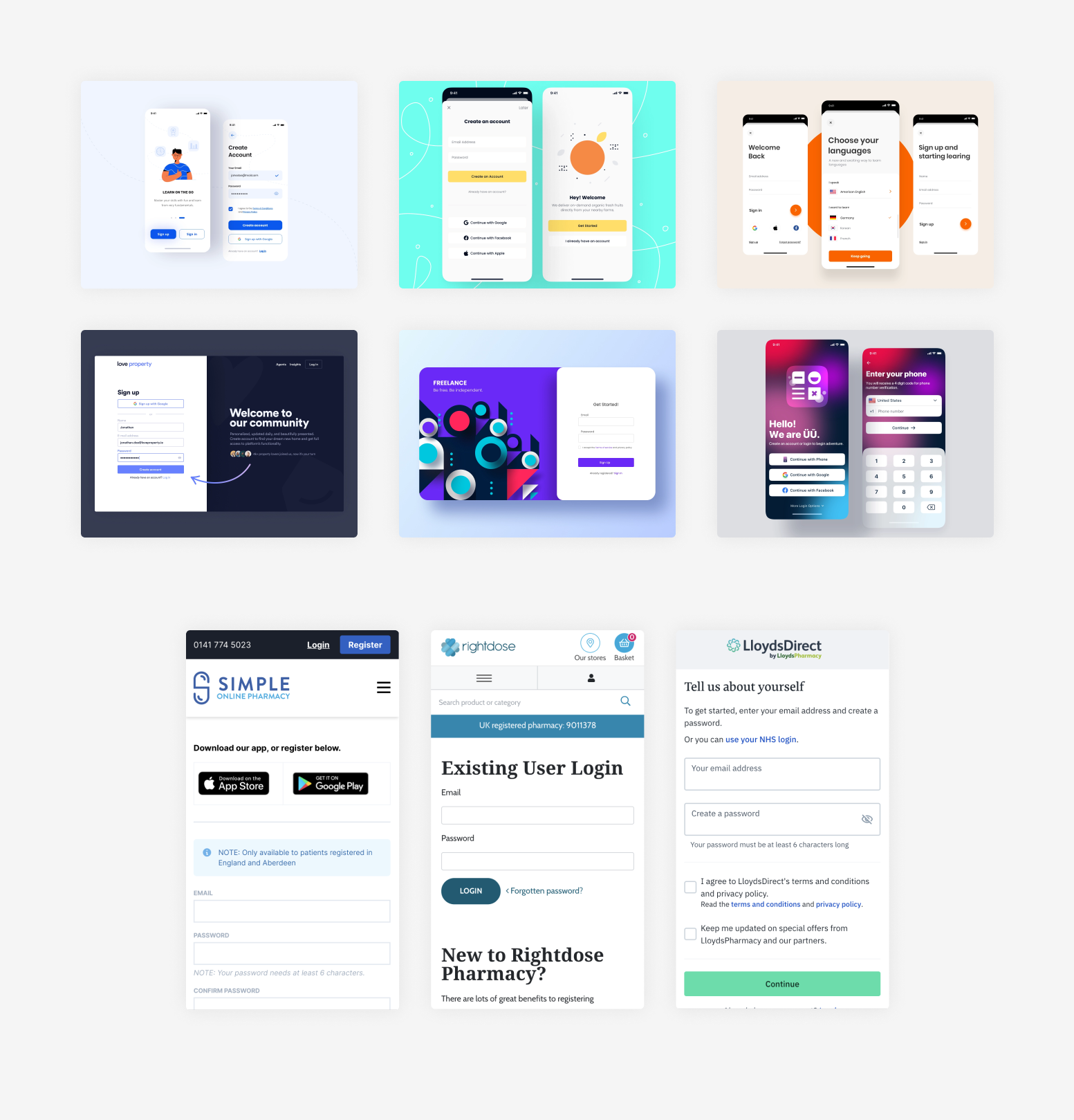
I knew that competitor research was going to be invaluable in preparing to tackle this project, I started by completing the equivalent sign up processes for Boots and Lloyds online products, this gave me a good idea of how others were tackling pharmacy specific issues.
Next was general research of current UX best practices for sign up forms and a vist to the .gov design guidelines. I found that completing this research early in the project allowed me to go into the planning and user flow stages with a good understanding of any potential issues to consider, especially around accessibility.
User personas were helpful when researching this project, I created three personas across a wide range of ages and technical ability. This exercise helped me to get into the mindset of our average patients and the diffculties they may have been facing in our onboarding, it also allowed me to challenge any assumptions I had going into the project.
As a pharmacy it is especially important to cater to all audiences and to any disabilities.

Age: 22
Location: Central London
Occupation: Student
Family: Lives with roommates
Tech ability: Confident
Katie moved to Central London two years ago from Edinburgh to study law, she stays with her two roommates and spends a lot of her time studying. She also works part time for a law firm and is currently working from home.
She decided to register with Phlo as she struggles to find time to pick up her prescription due to study/lecture requirements and working from home. She is used to ordering things online and same or next day delivery has become an expectation.
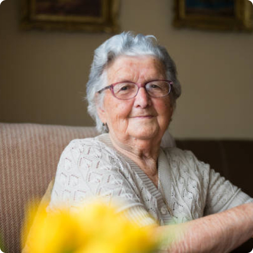
Age: 82
Location: Reading
Occupation: Retired lecturer
Family: Lives with husband
Tech ability: Some experience, not confident
Victoria lives in the outskirts of Reading with her husband, she retired from her job as a lecturer at a university teaching Chemistry. She has some experience of using a computer from her time as a lecturer, although that was some time ago.
She has a smart phone which she feels somewhat comfortable with but can get anxious when doing something new or outside of her usual usage.
Victoria's son and a daughter have grown up and moved out, they both live in the north of England. Victoria has decided to use Phlo after her sister recommended it to her. She has been struggling to leave the house to get her prescription medicine and worries about Covid often.

Age: 54
Location: Farnham
Occupation: Financial Director
Family: Lives with wife and 2 daughters
Tech ability: Passionate about digital tech
Grant is a Financial Director living in Farnham with his wife and two daughters, he spends a lot of time working and gets frustrated by any tasks he has to do after work which leave him with less time to spend with his family.
He appreciates convenience and likes to be an early adopter of new technologies/services which improve people's lives. Grant has a number of health conditions for which he is on prescription medication. Usually he collects these from a pharmacy near his office before heading home on the train.
He heard about Phlo from a friend and decided to look into what they offer and if they are able to deliver to his workplace.
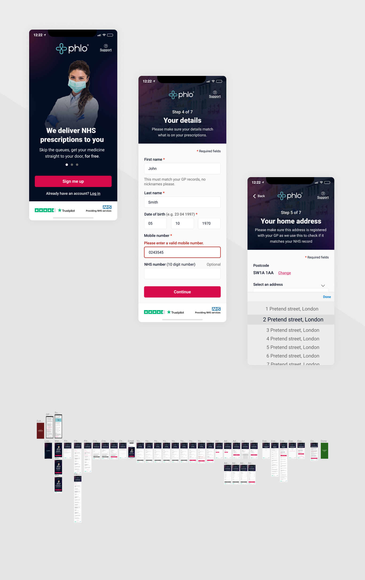
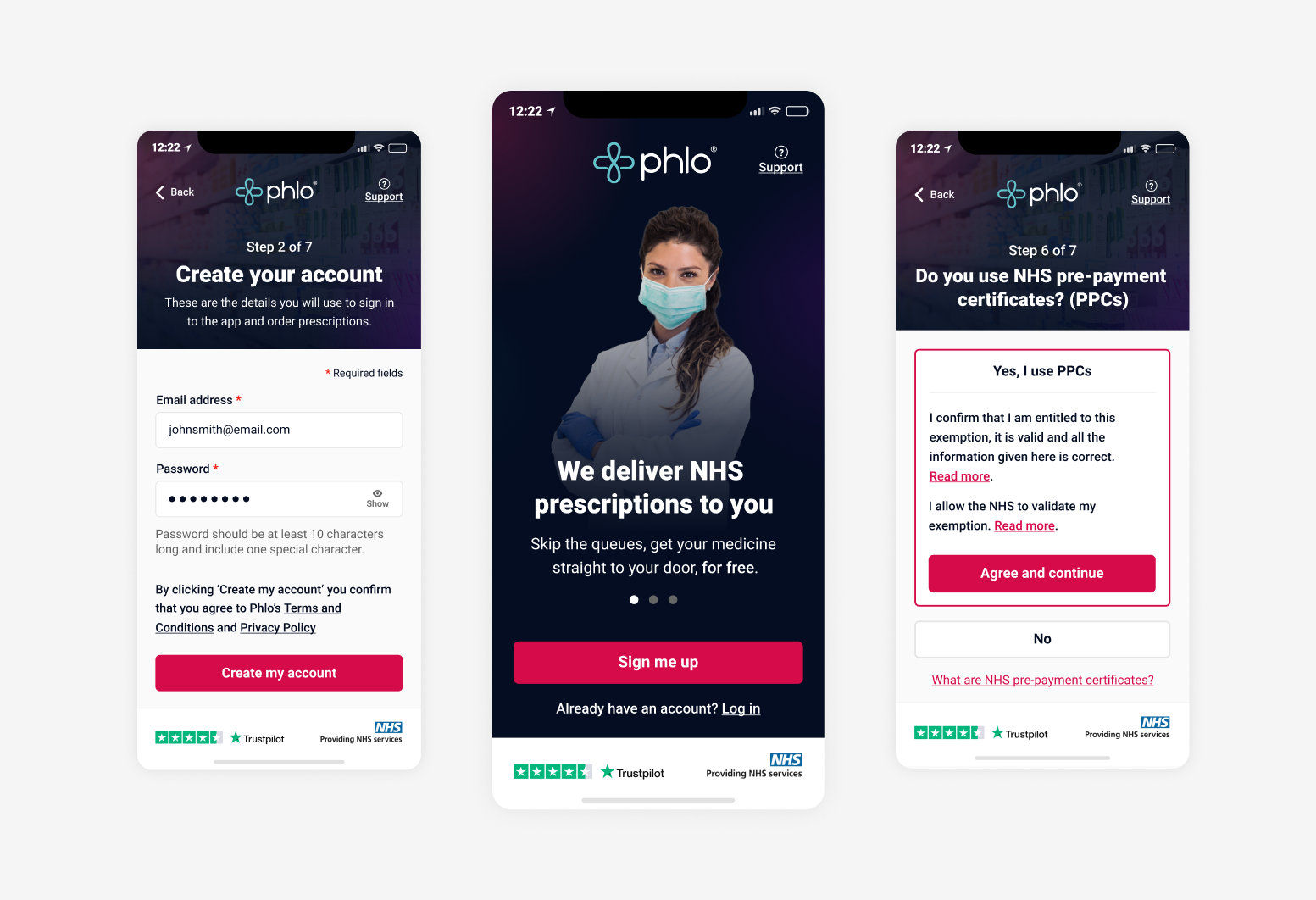
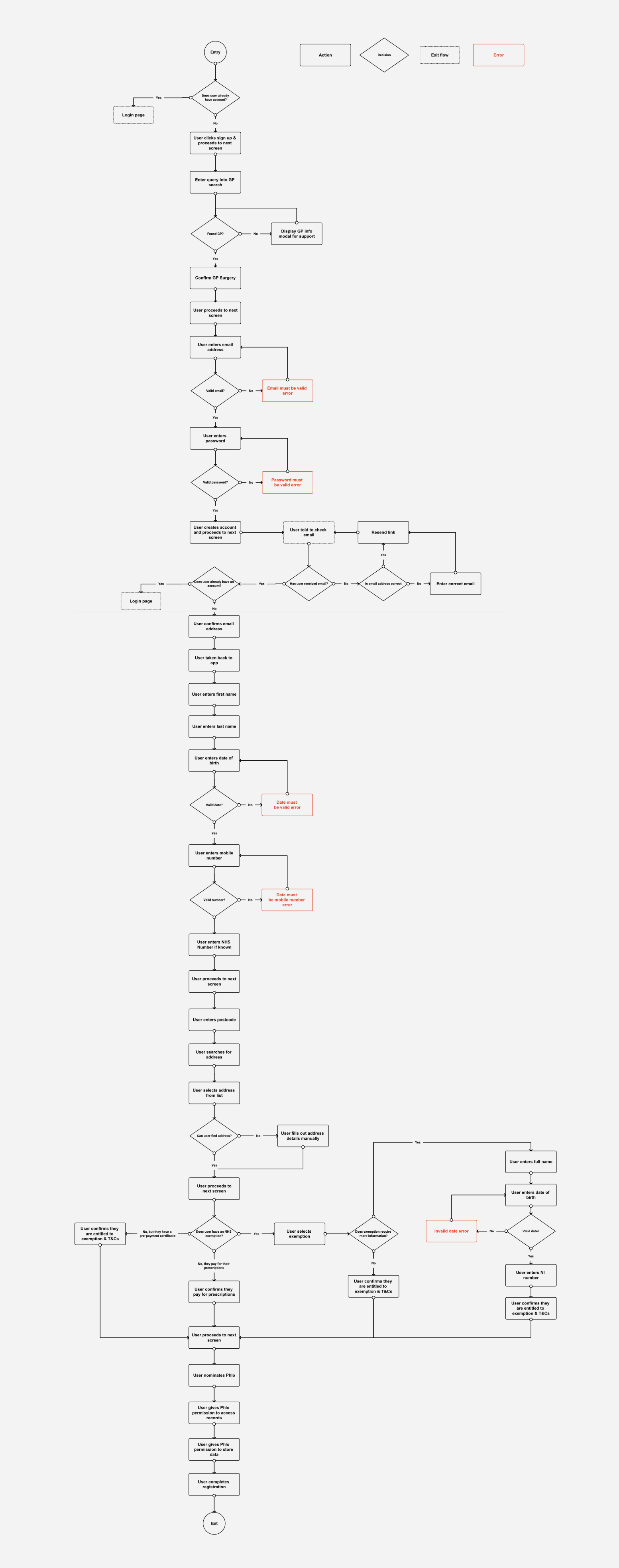
As this was such a large project with over 30 individual screens requiring design a user flow was a must. I started by mapping out the flow for the existing process, during this exercise I identified a number of pain points and errors which could cause users confusion and frustration.
One of the areas causing the most frustration for users was the GP selection screens. Our services are only available in England, users in other locations could fill out the majority of the form but would be stopped here. To solve this I moved the GP selection to the start of the process, this minimised the time invested before finding out if the service is for them. Below is the new version of the flow, which I based my low fidelity wireframes on.
Now that I had completed my research and had a new user flow I could start creating low fidelity wireframes.
A lot of the changes getting made at this stage were smaller accessibility and general user experience improvements. These included properly labelling inputs with placeholders and hint text, marking required fields and rethinking the wording used in buttons. The previous design used very little white space and was hard to scan, I made sure the new wireframes gave elements room to breathe and would reduce cognitive load in comparison to the older designs
I introduced a new design pattern to the sign up process, this was to have a consistent heading section on each screen which would be home to a page title, small explanation of the information we required as well as a link to the support section and an indication of how far along in the process the user was.
For the step indicator I made the decision to use plain text instead of a visual representation, this would give users a very clear expectation of how long they had to go in the process.
I also introduced a bar at the bottom of each screen which contained our Trustpilot rating as well as a reminder that we are NHS approved. The reason for doing this was to provide a constant component that should, at any stage of the sign up process, help with any doubts patients may have by reminding them of the credibilty of the company and service. Changing pharmacy is a big decision and it's very important at this point that we show the user we are trustworthy.
View wireframes prototype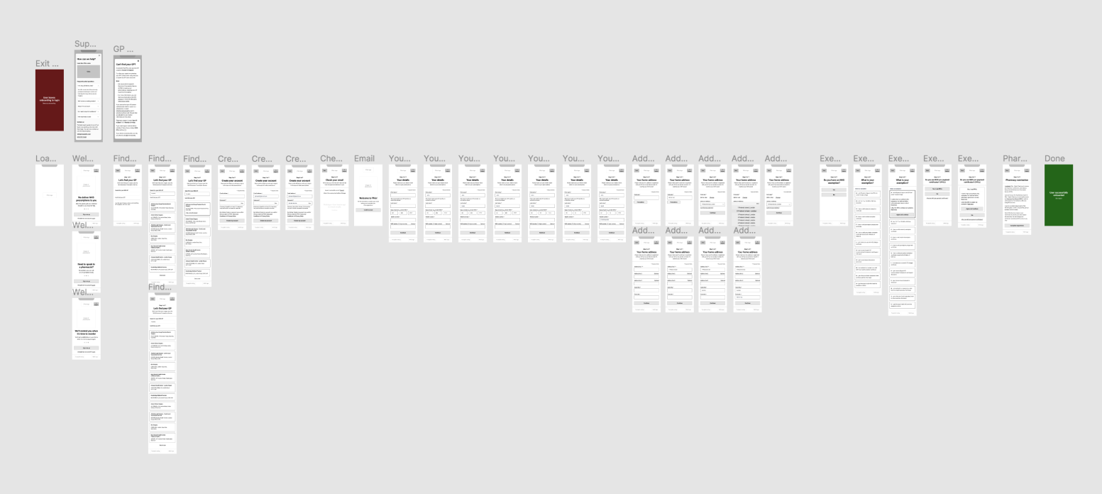
The final step was to take the wireframes and turn them into high fidelity designs, as most of the work had been done by the wireframing this stage was mainly around selecting images which would add value to the screens, a colour scheme which was appropriate for a pharmacy but also represented the Phlo brand accurately.
Some highlight or accent colours used in previous projects failed AAA accessibility standards for contrast so I took this opportunity to fix them.
The image of the pharmacist was used on the early screens to help aleviate any anxiesty the user may be feeling by letting them know there is a human team behind this process and help is there if needed. It would also hopefully help them relate to the brick and mortar pharmacies which they are likely to be familiar with.
View prototype