
Phlo Digital Pharmacy | September 2021
Earlier this year our data team had identified patient retention as being a major issue, with a lot of patients signing up to our services only to leave after one order or before even placing an order at all. As a start up this is something that had to be looked into urgently.
At this point we weren't sure what exactly was causing patients to leave quickly, without this crucial information our options were limited.
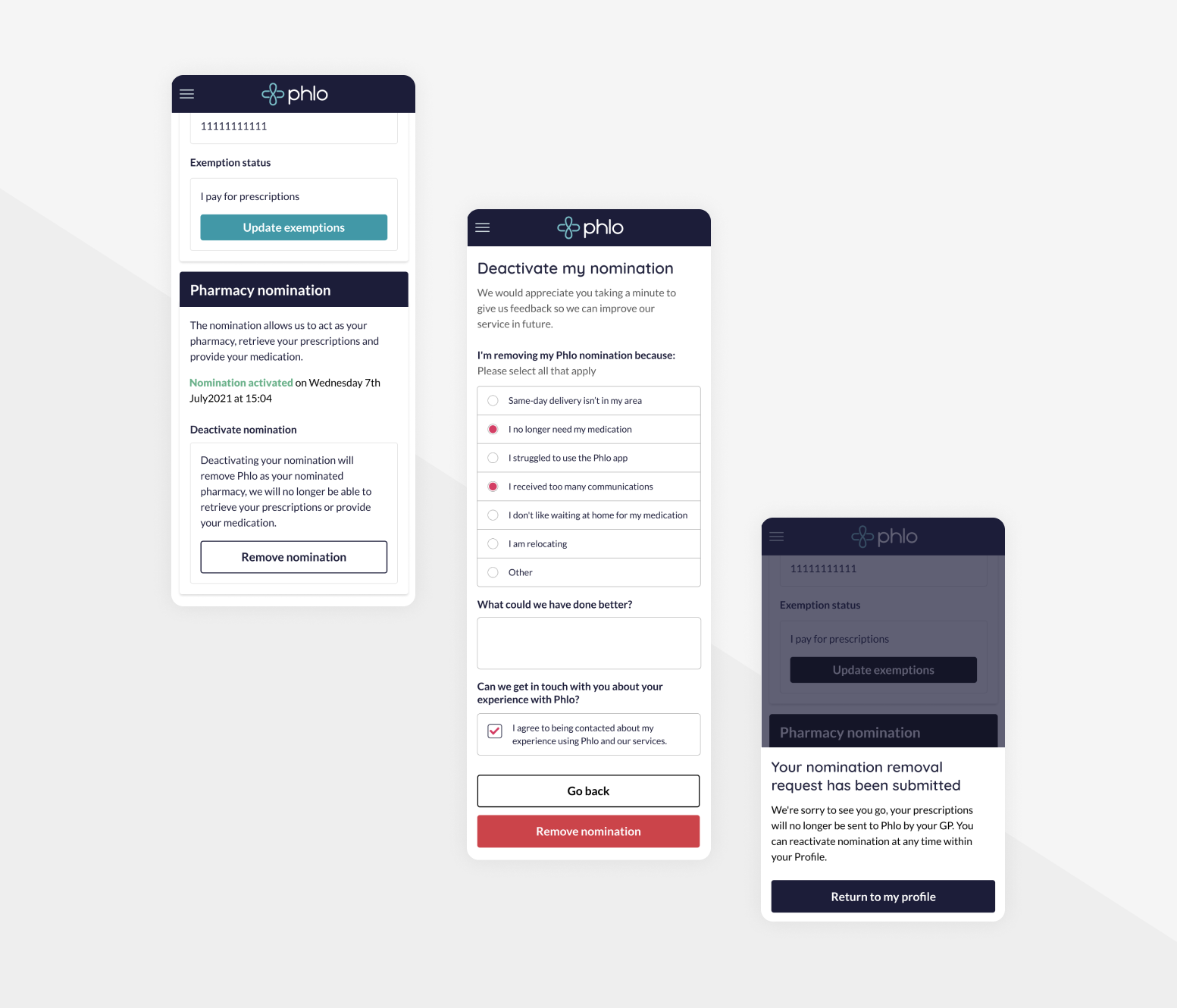
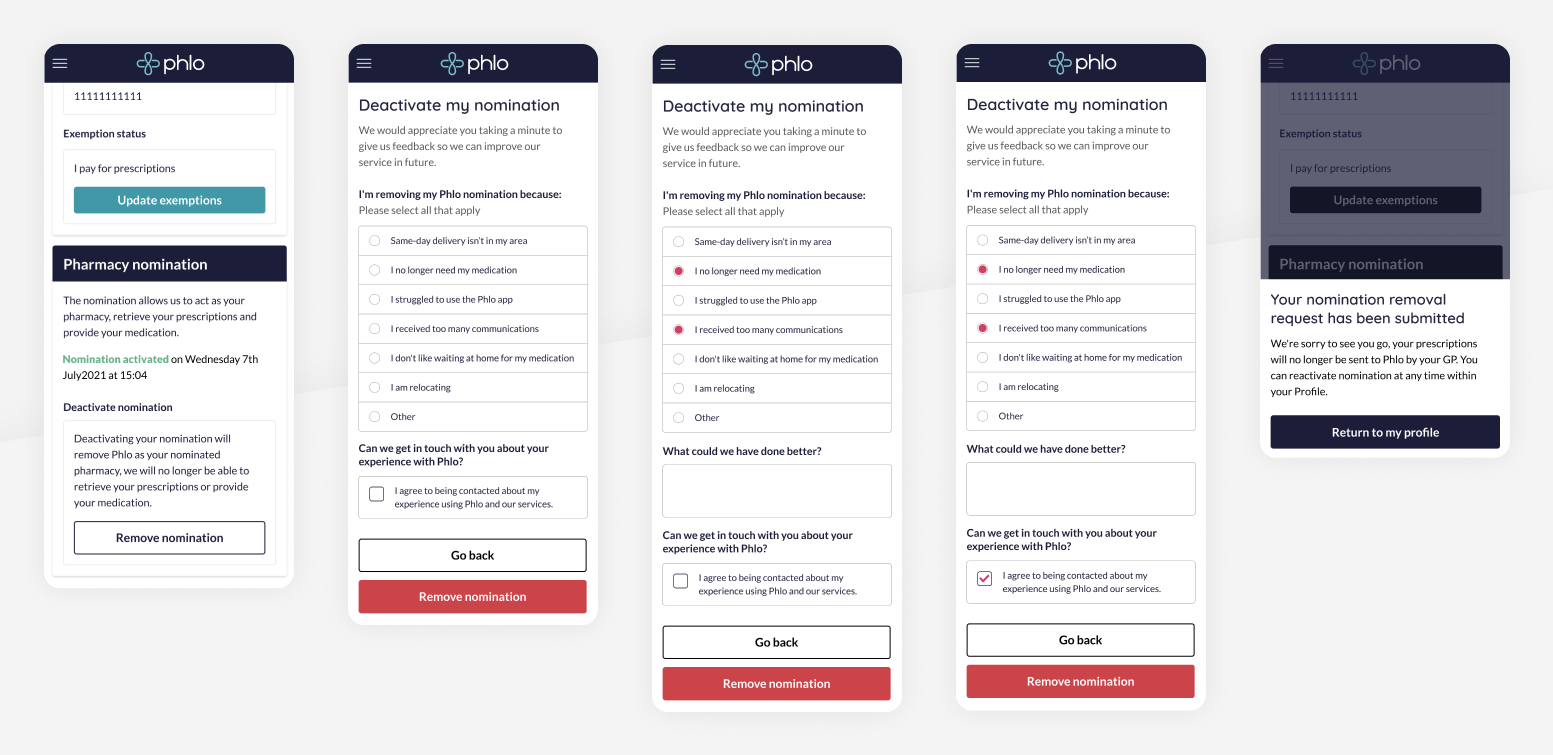
To gather our data we decided to impliment a leaving survey when a patient removed their pharmacy nomination through their profile (The pharmacy nomination allows us to act as their pharmacy by accessing and providing their medication). The removal of this nomination means we can no longer provide medication to the patient.
What could I do to help?
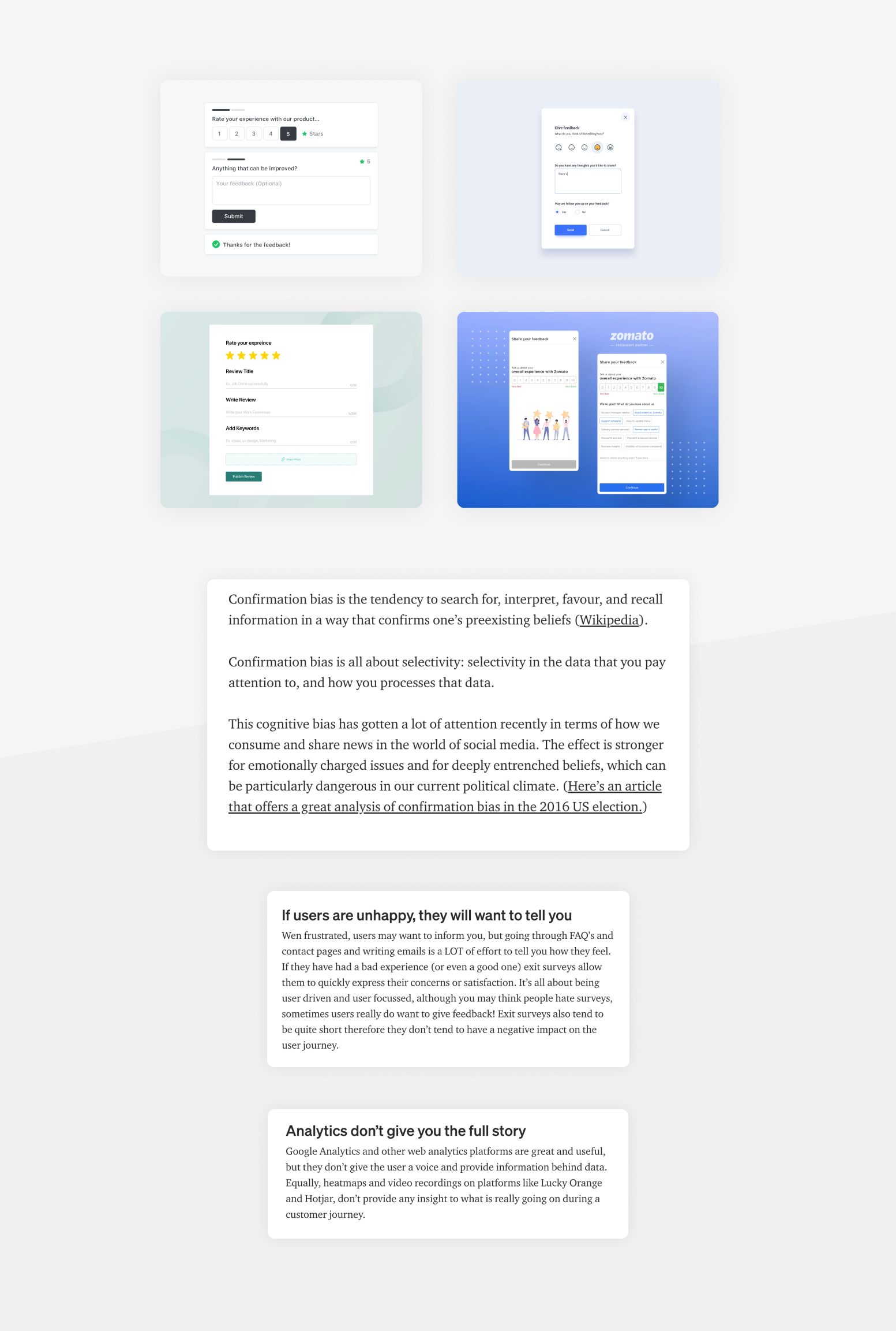
I found the research stage of this project to be invaluable, a lot of the psychology around users leaving a service was extremely interesting and definitely changed any pre existing ideas I had going into the project of what kind of questions we should be asking.
Confirmation bias and how to avoid it was particulary intersting to me, after reading a few articles about it I re-evaluated what I should be asking and identified some bias in the questions I had noted during the planning stage.
A couple of the most interesting articles I found were:
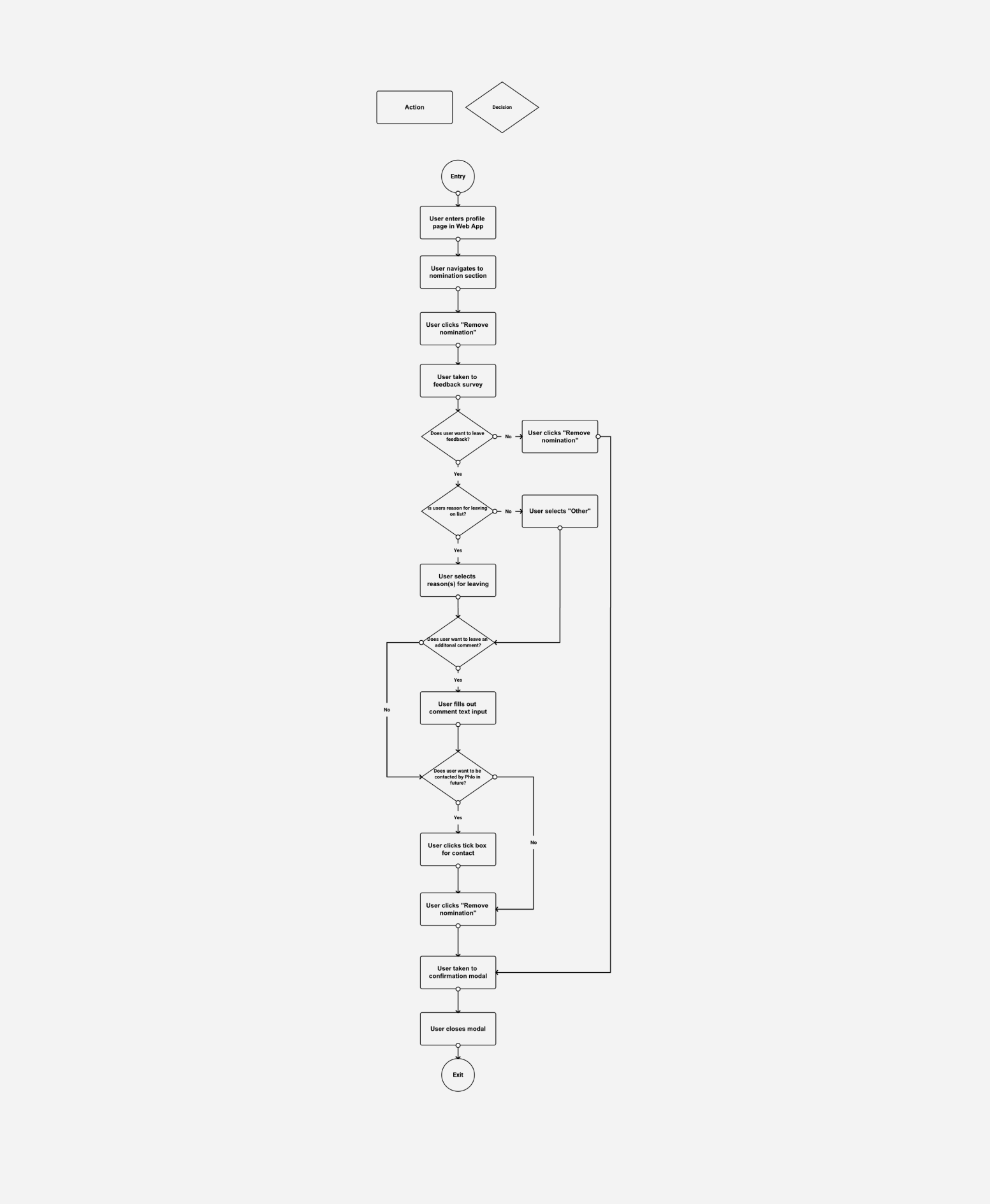
For this project creating a user flow helped myself and the rest of team get a better idea of how many different decisions the user was having to make as they made their way through the nomination removal process, this was a crucial part of ensuring the user wouldn't get frustrated at us asking for feedback.
It was at this point in the project we had a discussion as a team and decided to add the option in the flow for the user to completely bypass the feedback survey and remove their nomination. Although this would mean we may not get the data we require, it would provide a better user experience for our patients and avoid the risk of potential returning patients getting annoyed at filling out a mandatory form.
As we had already decided on our questions and our accompanying support copy at the user flow stage this step was all about ensuring the UI was as clean and intuitive to use as possible, as the patients want to leave in this scenario and are possibly unhappy I wanted to ensure this step wouldn't add any further stress.
I decided to go for a very simple design with lots of white space to keep the users cognitive load on this screen to an absolute minimum. A custom component was also required for this screen as we didn't have anything at the time that would provide the ability to select multiple options, after a few rounds of different design iterations with each version becoming more stripped back and basic we arrived at a clean solution that uses a circle on the left of the selection to signify a selected answer much like our existing radio buttons.
I tried to keep my wireframes very close to what the final design would be, only with the absence of colour. I find that it helps keep us all as a team focused on the content and layout.
A lot of work was done on the profile page where a user can choose to remove their nomination, from user interviews we had learned that the previous version didn't make it clear to patients what removing a nomination meant. I worked on a revised version which added some educational copy ensuring our patients were sure of what this action would do and why we require the nomination.
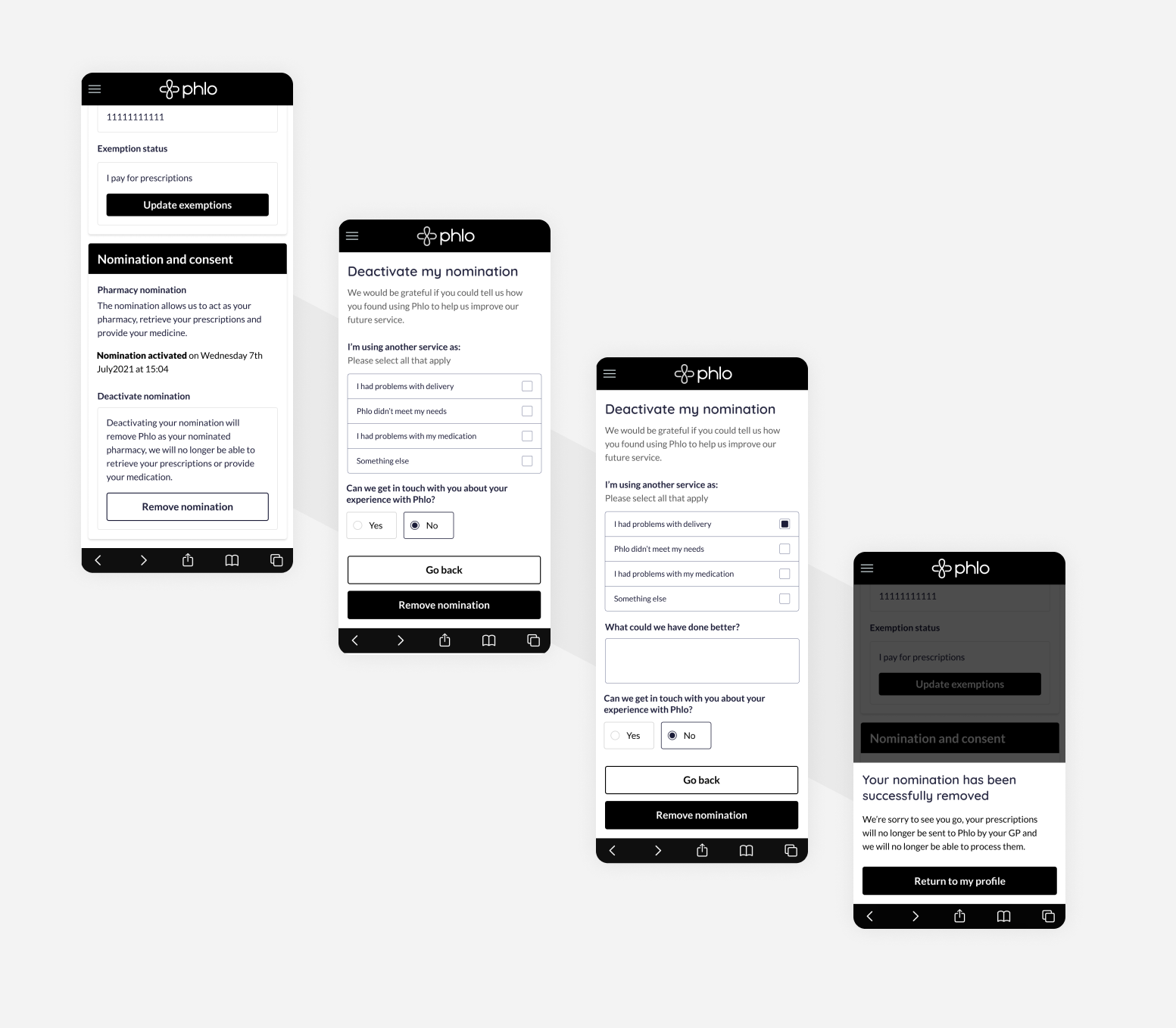
As I had created quite high fidelity wireframes for this project this stage was mainly focused on selecting the colours that would be used for our new survey.
One of the more difficult decisions in this process was choosing which colour would be used for the "remove nomination" button, our usual primary CTA colour didn't seem right as we don't want to encourage patients to select this option, but at the same time we don't want to do anything that could be making this button less obvious or hidden. I decided to use a red button in the end. The red button would hopefully give users, on first glance, the impression the button was deleting or removing something and was a serious action. This button and colour is used in many other places throughout our Web App, for example to delete or cancel and order.
 View more projects